
The signs you see in the street that include Braille and tactile elements are similar by design, and not coincidental. These signs need to meet specific requirements set by the Americans with Disabilities Act, commonly called the ADA.
This is a federal civil rights law passed in 1990 to ensure that people with disabilities have equal access to public life. It applies to public buildings, commercial facilities, and many private businesses that serve the public.
One of the most visible and practical ways the ADA promotes access is through requirements for building signage. These rules for ADA signs are designed to make spaces understandable, navigable, and safe for people with visual impairments.
ADA Signs Requirements
The ADA requires signs because access is not just about ramps and elevators. Being able to identify rooms, locate exits, and move through a building independently is just as important. Without accessible signage, someone who is blind or has low vision may be unable to find a restroom, office, or emergency exit without assistance.
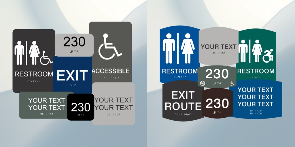
Under ADA guidelines, there are two main categories of signs that must meet accessibility requirements. The first is signage that identifies permanent rooms or spaces. These include restrooms, offices, conference rooms, stairwells, and similar fixed locations.
The second category covers exit and egress signage, which helps people find their way out of a building safely. Both types are treated similarly under the law because they serve essential navigation and safety functions.
Tactile Lettering
For these signs, the ADA requires two key features: raised tactile lettering and Braille. Tactile lettering allows users to read text by touch. To meet the standard, letters must be raised enough to be felt clearly and must be easy to distinguish from the background.
The lettering must be simple and highly legible. Decorative fonts, slanted styles, or ornate letterforms are not allowed because they make tactile reading more difficult. The law also specifies that tactile text must be uppercase and use clean, straightforward letter shapes.
This consistency helps users quickly recognize and interpret information. Spacing between letters and lines is regulated to prevent crowding, which can make both tactile and visual reading harder. These details may seem minor, but they play a large role in how usable a sign actually is.
Braille
Braille is the second required element. It must match the wording of the tactile text above it so that all users receive the same information. The Braille sign is placed below the raised lettering and must be formed with rounded dots that are comfortable to read by touch.
Spacing between the tactile text and Braille is also regulated. Adequate separation helps users distinguish between the two forms of communication and prevents confusion when reading by touch. If a sign includes decorative elements, those must also be positioned far enough away so they do not interfere with reading the information.
The ADA requires these signs because they promote independence and safety. In everyday situations, accessible signage allows people to move through buildings confidently without relying on others.
In emergencies, clear tactile and braille signage can help guide individuals to exits when time matters most. These requirements create consistency across buildings, so users know what to expect wherever they go.
ADA Rules are the Minimum Requirements
It is also important to understand that the ADA standards are the minimum requirements. Some states and local jurisdictions add additional rules or refinements, meaning compliance may require more than just following federal guidelines.
These ADA signs exist to remove barriers. They ensure that buildings communicate information in more than one way and that no one is excluded because of how they perceive their environment. These requirements create public spaces that are safer, more usable, and more inclusive for everyone.