
Branding is about a lot of things, and imagery has a lot to do about what a logo can say about your business. One crucial part is the color combinations used in a logo, as sometimes it can say a lot about a company’s industry and values.
So what color combination is the best when it comes to designing promotional products with logos? Choosing a color combination that will make your logo stand out in promotional items can be a bit tricky, especially if you lack design experience but still want to make a statement with ease.
Let’s look at logo designs and color combos that will make yours stand out.
The Most Common Colors
Logo design is all about creativity and proper representation, so often company logos will have different symbols, images, and colors that will support each company’s goals. However, there are specific colors that companies use more than others.
● Blue
● Red
● Black
● Gray
● Silver
● Yellow
● Gold
This list is based on how prevalent a color is used across industries and brands, but that doesn’t mean it’s the best. Often a color choice is based on what a company wants their audience to feel, and often they pair it with a color that is complementary to the hue.
The Most Common Color Combos in Logos
And given that kind of reaction, many companies also prefer specific combinations that are reminiscent of other companies or industries. Often these combos are based on the images and emotions they want to evoke in their industries, so here are the more popular color combinations:
● Blue and white
● Red and white
● Green and white
● Yellow and red
● Yellow and black
Often many brands prefer to limit brand colors to two, and often one is neutral while the other could be a primary color (red, yellow, blue) or a secondary color (green, violet, orange). Some brands, depending on their industry, will use more than three and still be recognizable; for example, Google.
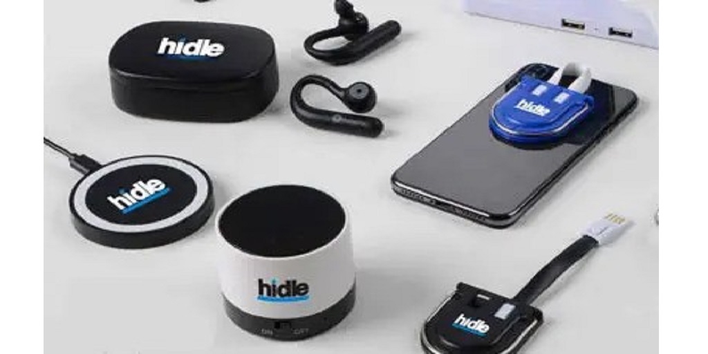
However, no matter what color combination is used, the color of the promotional product can go a long way in making the logo more visible and prominent.
The Best Color for Promotional Products
Every color has its pros and cons, but the best way to choose a color for a promo product to make your logo stand out is to make sure that your logo color is complementary, and can stand out even in high contrast.
Often the best way to choose a background color to make a logo stand out is to choose a highly contrasting color that does not clash with your logo. For example, Facebook uses a blue and white logo, which is easy to read and very recognizable. To create this same kind of feel if your logo is blue, you might want to consider a white base product to customize.
Often, many companies prefer neutral colors for their promo products, such as gray, black or white. If your logo has several colors, the best matches are white and black, as these can help them stand out.
If you use a secondary color such as yellow, red, or green, it’s best to match the promo product color with the logo background. So for example, if you want to use a promo product with a yellow logo similar to Mcdonald’s, why not use red as a background color?
Color is Subjective
Of course, color selection can be subjective, and even the emotions we draw out from their combinations are very personal. So most of the time companies rely on the most common color combinations in their industry to specify that they belong in such an industry.
So make sure that your logo represents your company and your industry, and the colors for your promotional products will make your logo stand out no matter where it’s placed.
If you’re looking for a straightforward solution for customizing products with your logo, our choice is iPromo. They have a wide selection of products with a multitude of color options, which makes it easy for companies to brand promotional products effectively.
